Introduction
Prénatal is a retail brand that focuses on pregnancy, baby, and kids goods. Their focus is not on products alone but on providing their customers with support, guidance, and inspiration throughout their journey for a great experience overall. Their presence consists of 44 megastores, city stores, boutiques, and of course the Prénatal webshop.
Prénatal wanted to find out what works best for their target audience(s) on their website. The main question they needed answered was: What makes a customer click? Testing different strategies and seeing what works before passing it on to the developers meant they could be certain of what needs to be built.
They found the answer in the no-code user experience platform of UNLESS which is strong when it comes to personalizing the experience of a visitor and optimizing the journey with the help of A/B tests. We spoke to Demi Dolman-Bok, junior web designer e-commerce at Prénatal, to hear more about their use case, experiments, results and takeaways.
The use case
When it comes to e-commerce, first impressions are really important. In a store, you can touch products or get assistance from staff. But online, the image of a product is a customer’s first impression. After which they might click on the product to see more information such as a description, list of specifications, and reviews from customers. But all of that is dependent on the first image.
The biggest challenges lay in A/B testing, for example with different versions of images. Does image A work better than B? We could not easily test this before and mainly relied on our gut feeling.
The value of A/B testing with a solution like Unless is twofold for large organizations like Prénatal (or Kruidvat). In addition to discovering what works, you get to implement changes and validate ideas quickly before they get added to the roadmap.
If the newly added content or feature does not live up to your expectations, it can be removed easily. This also saves your developers’ time as they have been focusing on other stories in the meantime.
And if an experiment is a success? Well, you get to keep it running via Unless until your developers implement it. Plus, your ideas can rank up higher when it comes to prioritization as they have already been validated and are backed up with hard data.
Currently, we mainly use Unless for A/B testing. By performing the A/B tests, we get clear results that ensure that we can make the right decisions in the future. This way we can also test changes ourselves before having the developers work on it.
Examples of experiences
Prénatal is a long-term customer and they have implemented many experiments with Unless. Here are a few examples.
Launch more shopping journeys with the right banner image
The banner on the homepage of a website is the number one thing that is seen by website visitors. And so, it plays a crucial role in setting the stage. What a visitor sees on the homepage, above the fold defines what they will expect from the rest of their journey.
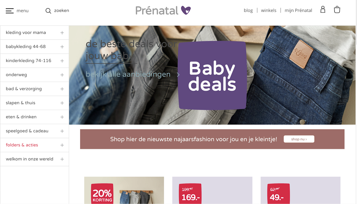
Above you will see the control group version of a cover image test that Prenatal ran during a “Baby deals” promotion. The original cover included a product shot, showing the pregnancy jeans that were one of the deals. But keep in mind that there aren’t any additional cues about the promotion, what else is included, or how much of a discount there might be.
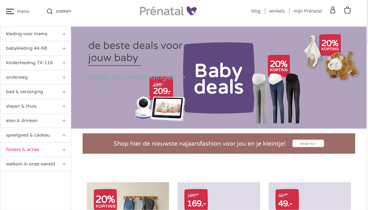
The alternative cover image they were testing included photos of multiple products with corresponding deal information. Now, a visitor could see that there was a 20% discount on pregnancy jeans as well as toys and that they could get a baby monitor for €209 instead of the original €239. Specific examples of the deals were presented with this image.
And this was definitely a success as it led to a 144% lift in clicks on the banner image that was tested. A click, in this case, is the start of a shopping journey. The experience didn't just result in a lower bounce rate but the potential for more interaction and sales in the long run.
Dazzle your customers with the right product visuals
Once a visitor has made it past the homepage, they tend to look at a product listing page (PLP) where product images are put under the spotlight. Now, there are many ways to display a product and it is possible to see combinations of different methods too. However, when it comes down to the main question that all businesses ask every day: “What sells more?”, opinions seem to differ.
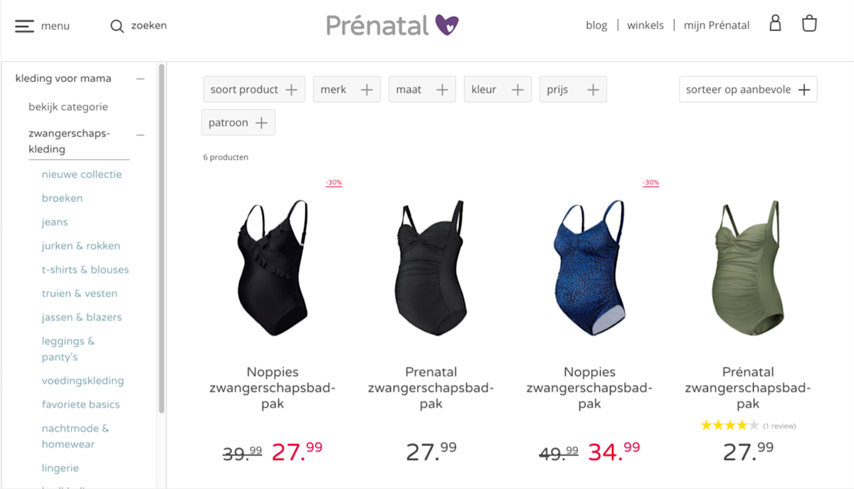
This means there’s a lot that a retail brand can (and should!) test to find out what works best for them, their customers, and their brand in particular. In the case of Prénatal, they wanted to test whether showing people wearing the outfits would lead to more clicks, compared to the sole product shot. And they opted for a mix of product and model shots as an A/B test. An alternative could be an A/B/n test where one variation only has product shots, another with only model shots, and the third one as a mix of the two.
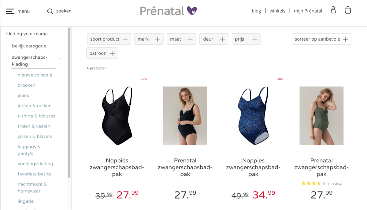
Going in, the expectation was that the experience with modal shots would lead to better results than the original. And at first, this assumption was confirmed. The results of the first A/B test on maternity jeans were very positive with a 28.4% increase in order completion.
However, when the experiment was expanded to other product categories, the results were mixed. Some categories had negative results while others were positive, in some instances as high as a 59.4% uplift in order completion.
This variation in results could be due to a number of factors such as the collection, the type of model photography, the background, etc. But that is exactly why we test our assumptions before implementing them and make sure what works, what doesn’t, and what needs further experimentation.
Offer guidance to your customers
Prénatal also came up with a system to help their customers choose a baby car seat for their child. By now, most of us are used to purchasing books or clothes online but when it comes to a baby car seat, chances are it’s the first time you are making such a purchase and you may not be familiar with the different features you should take into consideration.
That’s where Prénatal comes in to help with their choice help quiz. But to take the quiz, a visitor needs to be aware of it first, meaning it should be easily visible on the page, ideally above the fold. That way a customer is less likely to get overwhelmed and leave.
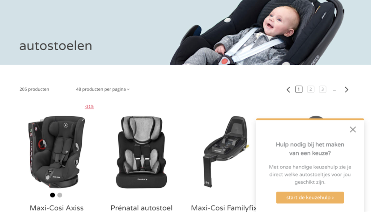
They created two experiences to see which one works best. In the first experience, they added a side-box that offers to help shoppers with making a choice based on their needs and a CTA button that will take them to the quiz. In the second experience, they’ve opted for an on-site experience where the banner image (with the baby in a car seat) gets replaced with a text that is promoting the quiz, along with a CTA button of course.
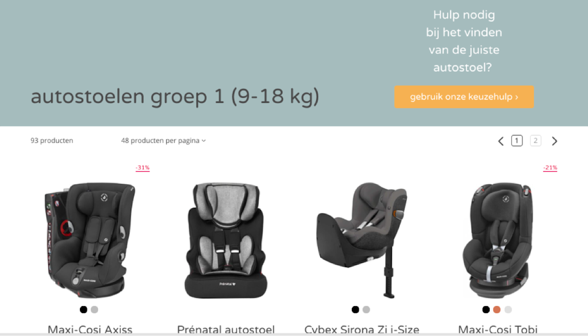
Prénatal wanted to first test the different options within Unless and validate them before taking the request to their developers. With both experiences, they’ve seen a significant uptake in engagement and the second example will be built by their developers in the near future.
Results
Prénatal has tested many experiences with Unless and continues to do so, reaping the rewards of a website that is continuously being optimized while also making sure that only ideas that have already been validated make it to their developers.
Unless is a growing company with great customer support. There’s real cooperation and collaboration with the users. They are always there to help you with questions and requests in a speedy manner. In addition, new functionalities are continuously added and optimized.
Key takeaways
Validation. Validation. Validation. There is a place for the gut feeling when it comes to coming up with ideas and different things that can be optimized on a website. But that feeling needs to be backed up with data. After all, you are not the customer. Unless can help in such cases, by offering a user experience optimization service that sits on top of your existing website or dashboards - regardless of what the backend looks like. With Unless, you can instantly create, deploy and validate ideas.