Maybe you need to show a website visitor how your system works and explain the steps included such as signing up, browsing options, placing an order, and so on.
Or maybe you need to inform a new user of your product about the actions they need to take such as setting up a goal, adding team members, connecting integrations, and more.
Maybe you already have a set-up for these journeys but you want to run some tests or personalize some of the steps based on what you already know about a customer.
In Unless, you have two ways to go about this. You can use a single component with multiple steps within. Or optionally, you can link multiple components to each other. For example, a pop-up followed by a side-box and maybe even an inline component too. Read on to find out how to set these up!
One component with multiple steps
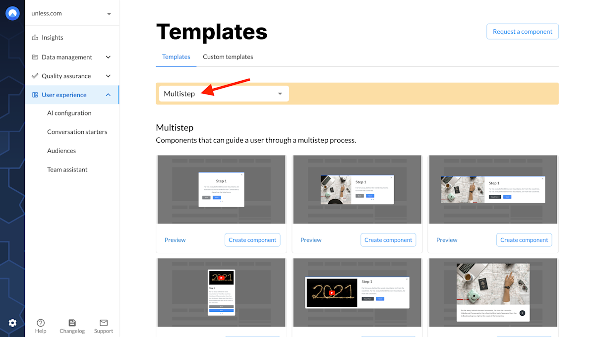
Let’s start with multi-step components. You can filter the component templates list for the Multistep category to view all available options at a glance.
Once you select the component you would like to use, you can adjust the settings like any other component and then open up the editor. Editing these components is pretty similar to any other with one addition: the Stepper tab.
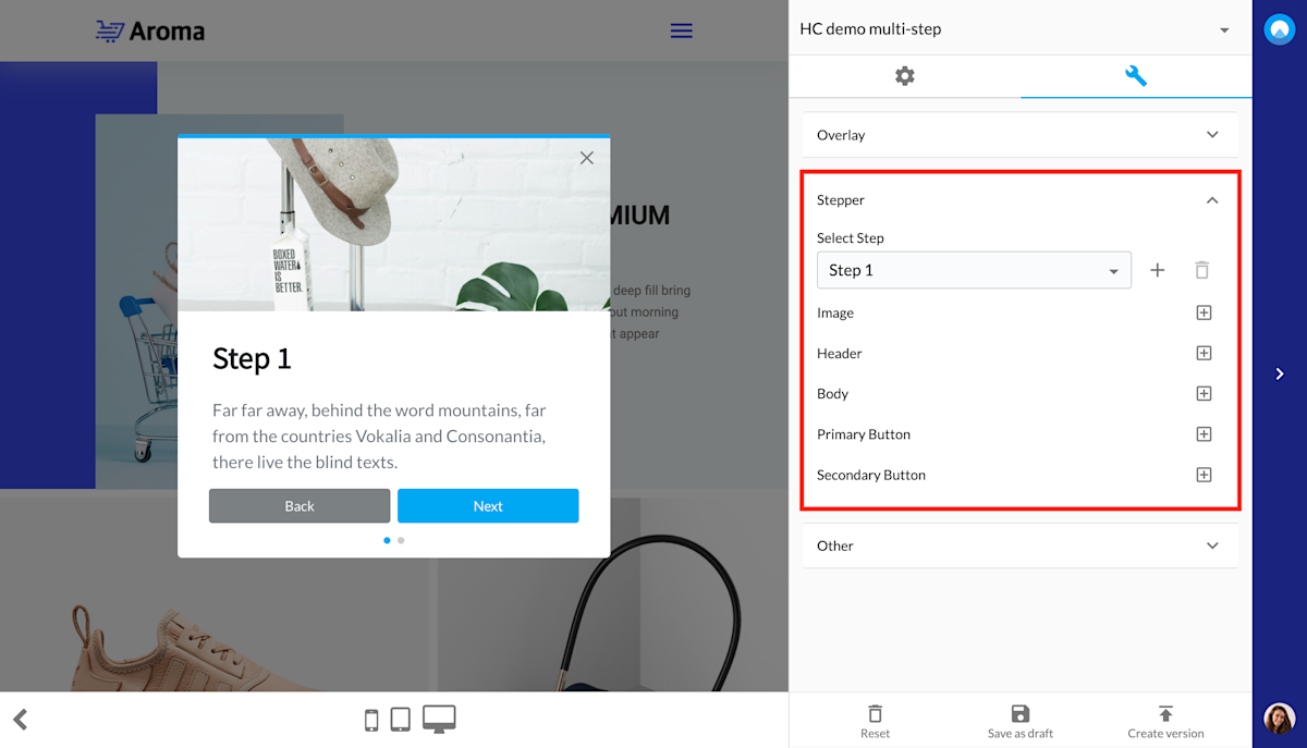
By default, each multi-step component will have two steps. You can then use the + sign to add more steps. While there isn’t a limit to how many steps you can add, we would advise not having more than three or four. Mainly because you want to keep the attention of your visitors at a high and their frustration at a low.
Editing the image, header, and body is the same as always - simply use the component panel in the editor. Following that, you can adjust the primary and secondary buttons which will stand for going to the next step or back to the previous. You can change the text field for these buttons but the functionality will stay the same.
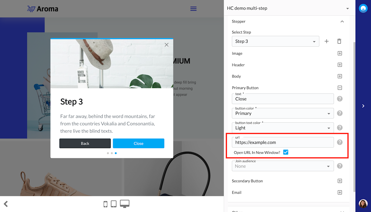
There are however some exceptions to keep in mind when it comes to the final step. Here, the primary button can either say and function as “close”, you can add a URL to take the visitor to or even provide some custom javascript that will be executed by completing the final step.
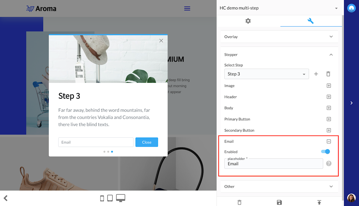
And another detail to know is that at the last step you can make use of an email field as can be seen in the screenshot below.
That’s all you need to know to set up a component with multiple steps.
Multiple components that are linked
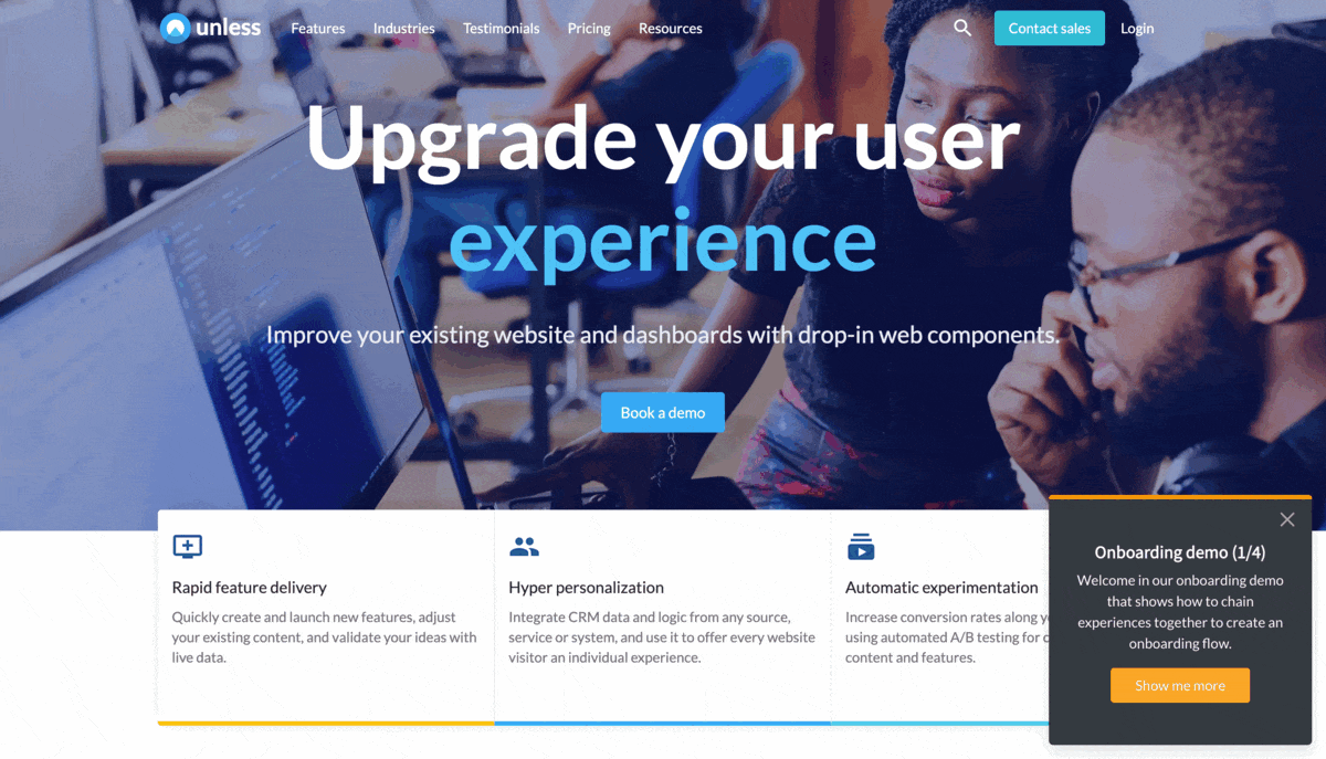
Alternatively, you can have various components that are linked to each other and show one after another. You can see an example of this below.
We will use the IDs of each experience to link them together. So you can start by creating each experience like you normally would. You can use overlay components as well as in-line ones and you also don’t need all experiences to be on the same page. Just like in the example above.
Then, in each experience, you will put the ID of the next experience to the URL field of the primary button as shown in the screenshot below.
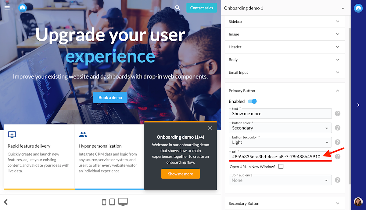
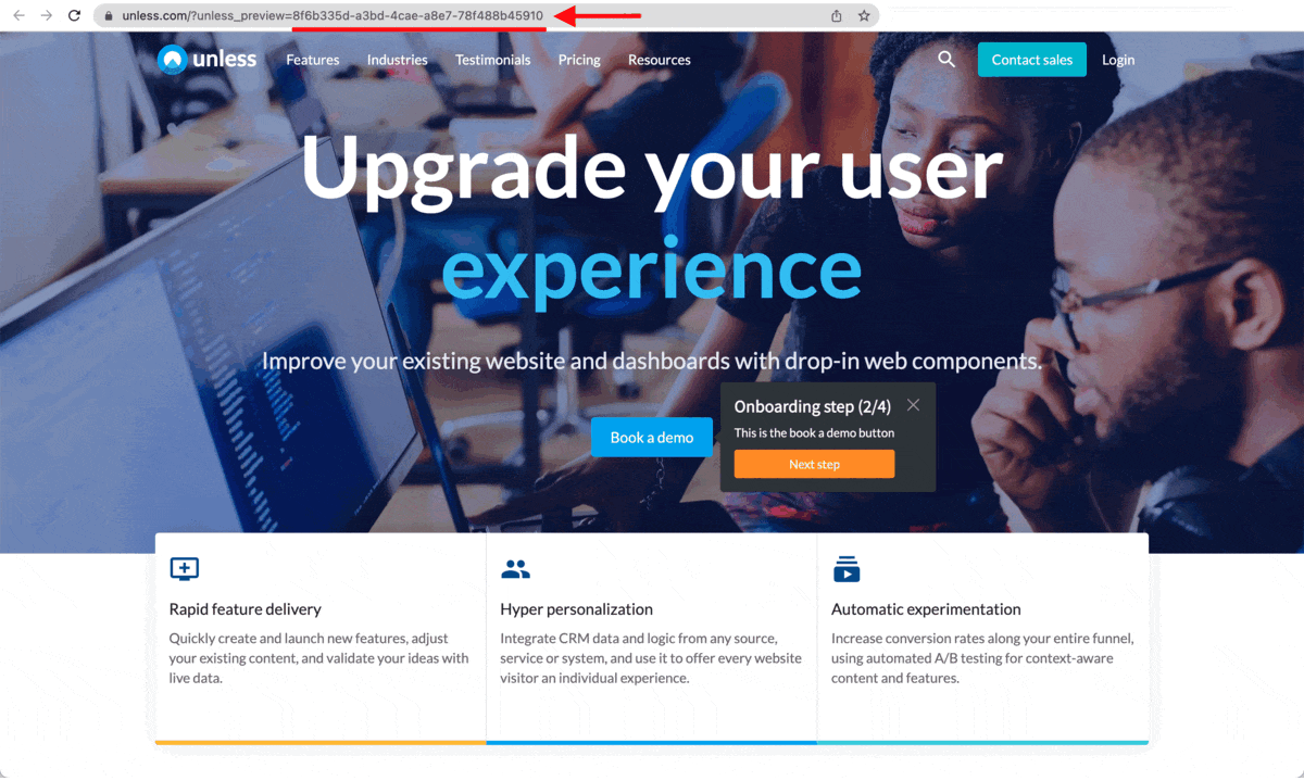
You can find the ID of an experience in the URL when previewing it or checking the settings page, as shown below.
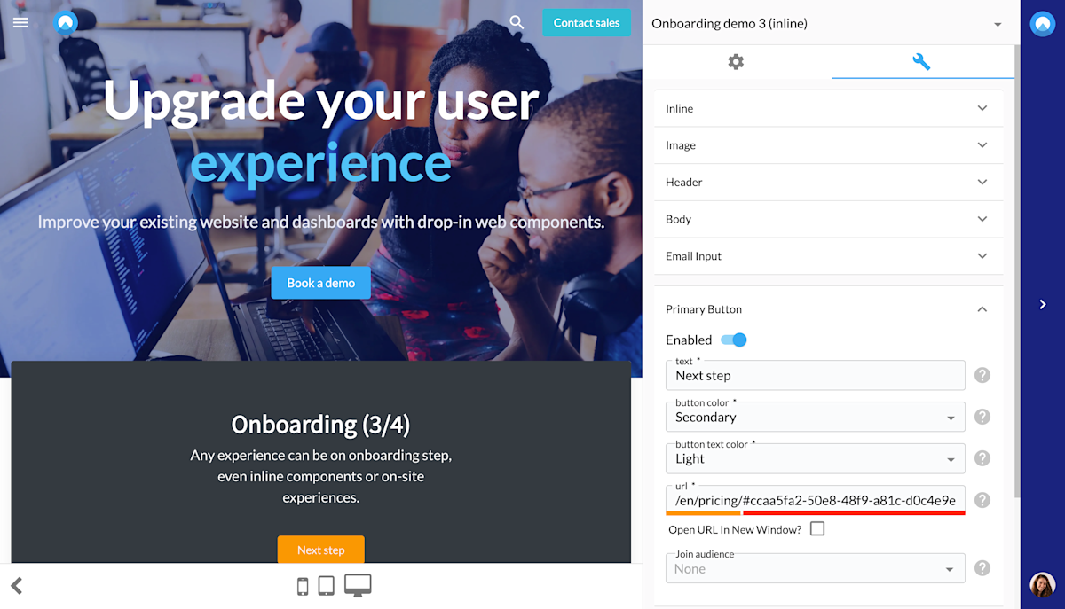
If you want to link to an experience on the same page you can simply use #[id]. If you would like to link to an experience on a different page, you should then use the path followed by the id. So in our example, that looks like /en/pricing/#[id], as can be seen in the screenshot below.
That’s it! You are now ready to create your own journeys whether it be a component with multiple steps or multiple components that are linked to each other!